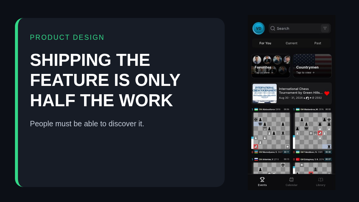
One of the hardest parts of building ChessEver is not creating a feature. It is teaching people a behavior they have never needed before.
I once asked two users what they thought about having a commentary stream beside the game. Both said they preferred following without video. That was reasonable. A stream takes space, and not everyone wants one.
Then I asked whether they had turned it off. Neither had.
The control existed. The product technically supported what they wanted. From their point of view, however, the feature might as well not have existed.
Useful and discoverable are different things
Builders naturally think in terms of capability: can the user do this? Users think in terms of what they notice at the moment they need it.
If a control is hidden, unfamiliar or explained at the wrong time, the answer is effectively no. Documentation does not rescue every design problem. Most people will not open a manual before deciding that a screen feels crowded.
I learned the same lesson from a chess player who told me that swiping between games would put ChessEver ahead of other broadcasting apps. I told him we already had it. The feature was useful enough that he independently imagined it, yet invisible enough that he did not know it was there.
This is worse than lacking the feature. When something is missing, the problem is clear. When it exists but people cannot find it, the team can congratulate itself while the user remains frustrated.
Chess strength does not guarantee tool adaptability
When I started ChessEver, I assumed strong players would be the easiest users to convince. Chess players adjust constantly. A position changes and we reassess. A stronger engine appears and professionals adopt it quickly. A new database method saves preparation time and soon everybody serious uses it.
I expected the same response to a better way of following events.
That assumption was only partly correct. Many strong players use ChessEver, but changing an over-the-board decision and changing a daily tool are different behaviors. The board forces adaptation. A familiar app does not. Even an inefficient habit feels comfortable because the user already knows where everything is.
A new product therefore competes not only against other products. It competes against memory.
Simple on the surface, powerful underneath
There is a real design tension here. If every feature is visible at once, the interface becomes cluttered. If advanced tools are hidden too deeply, the people who need them never discover them.
ChessEver deliberately keeps the main experience simple. Open an event, choose a game and follow it. Underneath that surface are different ways to personalize, watch, prepare, understand and organize. The current Learn page documents features one at a time rather than placing every possibility into the main navigation.
That is useful, but documentation cannot be the entire solution. The product itself must teach.
Teach at the moment of need
The best explanation appears when the user already has the problem.
If video is taking too much space, the interface should make the hide control obvious near the video—not expect the user to remember a setting from onboarding. If someone repeatedly opens games from one event, a subtle prompt can explain swiping after the first manual switch. If a player searches for the same opponent several times, that is the moment to introduce Favorites or player preparation.
This is different from showing a ten-screen tour immediately after installation. New users skip tours because the information has no context yet. By the time they need the feature, the explanation is forgotten.
Teaching should also be reversible. A prompt needs a clear dismissal. A new default should not trap the user. People should be able to experiment without worrying that they changed something permanently.
Observe behavior, not only answers
Asking users what they want is helpful, but their actions often reveal a different problem.
“I do not like the stream” sounded like a preference about video. The follow-up question revealed a discoverability problem. “You should add swiping” sounded like a feature request. It revealed that an existing gesture was invisible.
This is why product conversations need specific questions. What were you trying to do? What did you expect to happen? Where did you look? What did you do next?
A general question such as “Do you like the app?” produces praise, frustration or preference. It rarely identifies the broken step.
Innovation creates a teaching obligation
Familiar products benefit from conventions. People already know what a play button does. They know how tabs work. A genuinely new interaction has no such advantage.
Every innovation therefore creates two jobs: build the behavior and teach the behavior. The second job is not marketing added after development. It is part of the feature.
The standard should be demanding. A feature is not finished because it works in a test. It is finished when the intended user can discover it, understand it, recover from mistakes and remember it the next time.
ChessEver will keep adding capabilities, but more is not automatically better. Sometimes the most valuable improvement is making an existing feature obvious. Sometimes it is removing a step. Sometimes it is accepting that a clever gesture needs a visible button too.
The goal is not to make users study ChessEver. The goal is to let them spend their attention on chess.